The Old and the New
Tobias Wulf
Our relationship to including architectural history in our design activities has changed over the past decades. At the beginning of our work as solely responsible independent architects in the late eighties and early nineties, our focus was on nurturing innovative habits and creating contrast with neighboring existing buildings. The new should be distinguishable from the old. An example of this is the tithe barn in Böblingen-Dagersheim that was converted into a community center and completed in 1993. Here, a skewed glass addition contrasts with the mighty historical building, which has dominated the urban scenery here for centuries. Nevertheless, the place and its urban context played a crucial role from the outset in the building’s appropriately scaled articulation and its atmospheric allure. Although our designs were never just abstract and were definitely also metaphorical, even at that time we were not inclined to draw upon historical references or even cite other styles. Postmodernism seemed to have been overcome for good and in our surroundings, it increasingly fell into disrepute. Instead, the architectural language of modernity was what first and foremost came to mind when it was time to take an architectural stance. The new building for the Municipal Works in Ettlingen (1989–1994) was also completed at this time: with its north facade that strongly emphasizes the horizontal, the elongated white main building takes up a basic model of modernism. The common thread of modernism, which is so important for our work, evidently successfully weathered the equally short and turbulent phase of postmodernism. By way of contrast, pitched roofs – especially in traditional typologies – were now perceived as kowtowing to the client. Bit by bit, we have viewed this assessment less dogmatically and have never looked at the roof form as an isolatable design problem. But it was always important for us to act as a driving force and to not solely respond to external influences. Thus with the annex building for the Deutschhaus High School in Würzburg (2003–2008), for example, we proposed a gabled roof, even though the client had already agreed to the flat roof that we had originally intended.
In recent years we have dealt extensively with existing buildings. Not only with the landmarked highlights, but also with the vast existing building stock from less popular eras like the sixties and seventies, which must be adapted to our current requirements for utilization, energy consumption and, indeed, also architectural quality. In the Vocational School Center North in Stuttgart (2008–2014), for example, we are developing such a transformation as part of a long-term planning process, taking into account and strengthening the original architectural intention of the horizontal slab architecture that was incorporated into the hillside beneath the Weißenhofsiedlung. Such projects are occupying an ever-broader space in our current range of tasks, while pure new buildings are becoming increasingly rare. In case of doubt, preservation and revitalization always come first for us before demolition and new construction.
Since 2008, we have also been working on one of the last taboo subjects in architectural history, namely the exploration of the built heritage of Nazism. The landmarked, so-called Ordensburg in Sonthofen (new master plan to be fully implemented by circa 2020) undoubtedly represents a major work from this period. In addition to the immense size of the complex, this comes from the quality of the buildings, which were erected from 1934 to 1942 by Hermann Giesler. Dealing with this cultural heritage initially led us to engage in a theoretical exploration, which formed the basis for an attitude toward the continued architectural development of this major project, which relies neither on contrast nor on continued building in the manner of the existing. This project is a special case with its own special dictates, which we must seek to selectively influence – even in a setting where people are not accustomed to thinking primarily about cultural matters.
We now realize that the architecture of earlier eras produced far better results than is possible with contemporary construction, because the latter is dominated by purely quantitative optimization processes, often with false priorities.
So it is not surprising that amongst the general population as well as among politicians and many architects, there is nostalgia for earlier times. Even diehard supporters of modernism can hardly dispute that most of the buildings from the 19th century, for example, exhibit better spatial and design qualities than the corresponding building types of our time. It’s primarily about clarity of the typology and an awareness of space. The now widespread tendency toward reconstruction, however, is alien to us. This attitude may be warranted here and there – and in some cases even desirable – but it is a task for researchers and restorers, not for architects. So-called creative reconstruction is a contradiction in terms. The notion of continued building is much more agreeable to us, because we appreciate the great value of continuity in urban design as well as in architecture. When we are faced with a design problem, we do not feel obliged to seek a unique and unprecedented solution; instead, we particularly ask ourselves how this specific problem would have been solved by important architects of the past and the present. It is indeed a tempting thought – that some architects succumb to nowadays – that it really doesn’t matter what era a building comes from as long as the quality is right. This romantically glorified attitude, this commitment to a temporal no man’s land, is something we do not want to follow. Architecture, like all art, is for us most importantly also an expression of its time – and thus of the present – and ideally it is an impulse for the future. We currently live in a time in which we increasingly look back to the past. But we see this as a chance for the future, as long as the view is not narrowed by hiding current problems. By this we mean not only the shortage of resources but also the currently prevailing thought and behavior patterns that are governed by the primacy of ostensible economy and thereby suffer from a substantial lack of culture.
Identity through Search
Tobias Wulf
The path that hikers take is never perfectly straight. They react with sensitivity to topographical changes and navigate around obstacles that block their way – or succumb to psychological influences. Even on level ground, their path resembles the slightly meandering, searching lines of a hand-drawn sketch.
Even if a boss sees himself as a great master, his proposals can still lead astray. The naive suggestion of a young intern can still be of great importance even if he is unaware of its significance. One must simply recognize that and accept it.
Creativity is the ability to unify complex issues in a very simple idea. This entails acumen and concentration, as well as an ability to accept and promote completely unconventional ideas or even ones that are radically »different« and antithetical. Creativity is a process – on the threshold between the right and left hemispheres of the brain – that can be facilitated by briefly switching off the brain. Latitude can often be found where it isn’t expected. A large trove of personal images helps to get things moving, but does not generally represent the goal. A combination of curiosity and willingness to repeatedly rethink things helps us buttress our attitude toward design. And it also helps us summon up creativity during the planning process and along the way toward completing the built work.
Naturally there’s an existing solution for almost every architectural problem; in fact, there are usually several. But to investigate these and then employ one of them doesn’t really bring you further if you do not strive to find the specific facet that makes a particular task unique and distinctive. For us, a specific approach is more important than resorting to tried and tested architectural elements or a fixed canon.
This consistently open and team-oriented approach requires great concentration during discussions and, above all, a trained ability for judgment. Holding weekly architecture talks in the office with changing participants is one of the elements that regulate this process. We equate the route to a distinctive architectural identity with an ongoing search.
Intuition or Reason?
Tobias Wulf
Most architects believe that they must substantiate their designs at every stage along the way. The justifications are often quite different – depending on whom they are directed at. Clients are inundated with arguments that are purely functional or quantitative in nature. We observe this with concern as it reduces clients to their function as »consumers« and subordinates their emotional desires and abilities to purely rational aspects. Apparently we have too little confidence in our clients. One reason for this is certainly the fact that, especially with major construction projects, the client is rarely a single individual any more. Thus a direct dialogue is almost impossible, and what remains is at best an abstract notion of the client. In fact, one is confronted with increasingly larger committees in which everyone is frightened by everybody. As architects, we do not want to be infected with this fear. For us, architectural ideas come mainly from intuition, so at first, it is important to find the right idea at the right moment. A good idea at the wrong time, however, is of no value for developing an architectural concept. For something new to emerge – as opposed to a routine solution – the right people need to come together at the right place and at the right time. This is precisely the special challenge of design. To be able to deal creatively with a wealth of experience is one of the secrets that enriches our profession and makes it interesting on a day-to-day basis. The intuition comes first, then the explanation – for our own understanding. If our intuition is solid, it may be passed on as the real truth of the design. We see this as an honest basis for the design process.
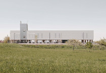
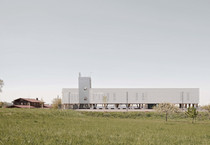
Since 2008 we have been working on the restructuring and expansion of the Ordensburg in Sonthofen (scheduled for completion in 2020). This significant work from the Nazi era was built by architect Hermann Giesler (1898–1987), who lived in the neighboring town of Blaichach and became Sonthofen’s district architect in 1933. The prominent scenic location of the building ensemble in a spectacular mountain setting can create associations that go far beyond the actual place and its oppressive atmosphere. How does one deal with such a task – one that poses such unusual challenges? Since the entire complex and all its main buildings are quite rightly landmarked, we approached this planning task with due respect. Simply continuing to build in the manner of the existing is certainly not possible here. The military property is to be converted into a modern service center that shall be open to not only members of the German military but also to those of other armies. Throughout its history, the Ordensburg has already undergone several extensions and changes of use. Originally planned as a so-called »Hitler school«, the buildings were not primarily intended to serve military purposes but to be an elite school for adolescent boys. Only later did it become barracks for the armed forces: the Generaloberst-Beck-Kaserne. The building stock, constructed in the years from 1934 to 1936 using the best craftsmanship and intended to last for »a thousand years«, was in almost pristine condition as we began with our work. Aware that the life cycle of today’s buildings is usually much shorter, we are striving for an architectural language for the new buildings that should appear timeless in a thoroughly non-ideological way by avoiding the pictorial and by using the clarity of an abstract formal language and its use of exposed concrete to provide a natural and unemotional commentary. Themes such as symmetry and axes were reinterpreted, not as a means of increasing the monumentality of the ensemble but rather as reference lines to the surrounding landscape. The landscape itself holds the potential for monumentality and timelessness that goes beyond any ideology. Therefore, for example, the main central axis of the entire complex should not – as originally planned by Giesler – be aligned to a huge monumental cultural palace, but diverted upward, wedge-like, past the new guard post to make a visual connection with the mountain range in the background. This is our interpretation of a theme that Giesler himself had already employed on the opposite side of the axis. He only sited two objects there: an open pergola that frames the view of the Hörner mountains beyond the Illertal and the so-called Pallas tower – the widely visible symbol of Sonthofen – which is clearly placed alongside the axis. As a counterpart to the Pallas, which is a tower that was really built just to hide the chimneys of the heating plant below, we have erected a new heating plant, a wood-burning incinerator, on the opposite side. Its almost thirty-meter-high chimney nearly reaches the height of the Pallas and was constructed in the form of a single, abstract steel tube with a diameter of 2.80 meters. With these proportions, the building is able to powerfully assert its presence in the surroundings without dominating or drawing undue attention to itself with superficial contrasts. This architectural attitude of »powerful restraint« is one that we wish to apply to the other buildings on the grounds of Sonthofen’s Ordensburg.
Conceptual Design
Tobias Wulf
Actively working as a designer on various projects that also include competitions – as well as serving as a judge and working as a design instructor at the university – helps to sharpen one’s view of the conceptual substance of architectural designs. The quality of a design does not depend on the recognizability of formal or material elements, but the consistency of the substantive concept. Every task is intrinsically different, and recognizing that is in no way purely an architectural challenge. The trick is much more a matter of interpreting – and scrutinizing – major concepts and translating these into architectural concepts. This translation work is a creative act that strikes a balance between consistency and arbitrariness. Ultimately, the result should be not only rational but also emotionally intelligible.
Concepts do not take shape immediately, but evolve from thoughts, images, memories and visions that might first take written form. Keywords or catchphrases as design principles can, like icons and conceptual models, serve as guidelines that structure the entire design process. Nevertheless, the question “What did I really actually want?” must be asked time and again, because designing is a task of searching in different directions. We do a great many competition designs not solely in order to obtain new commissions, but also because they are a field of trial and error and serve as a means of approaching new issues; they are a field of experimentation and help to explore limits. We cannot expect that the consensus view of a heterogeneous jury will always result in a prize being awarded to the best conceptual designs. But usually the best concepts are the ones that are very simple and intelligible, which gives us confidence about also succeeding in a competition now and then.
The aforementioned clarity and simplicity of a concept is generally not immediately apparent, however; it usually emerges only after arduously working with all the relevant factors and following a rigorous assessment process.
Over time, you get a feel for the viability of a concept. Nonetheless, as a basic principle we never apply the same concept a priori to different design tasks, which is why our results always differ considerably from one another.
Space – Between Effect and Effectiveness
Tobias Wulf
One or more notes alone do not constitute a sound; for that, a space is needed. Conversely, one could also observe that a space must “resound” in order to create an appropriate mood, an atmosphere.
If you attend a project meeting on an ordinary day at work, you might be surprised: So many highly educated professionals are sitting around the table, talking about spatial efficiency, utility routes, short distances and easy-care surfaces – but hardly anyone talks about the atmospheric effects of the space. Instead, they talk about architectural volume, the spatial program, etc. And yet a consciously designed space is the elementary »professional goal« of each and every architect. The basis for this is mainly an awareness of the sensory qualities of a space: What emotions does it trigger in us? What memories does it recall? What mood does it evoke? What narrative qualities does it have? – Instead, the requirements put on the space are described with terms like »column-free«, »flexible use«, »multi-coded« or »readily accessible«; but terms for qualities pertaining directly to the phenomenon of space, such as »impressive«, »oppressive«, »liberating«, etc., are seldom used. In this spirit, the person who experiences the built space is reduced to the brittle term »user« – because efficiency is paramount.
On the other hand, one can observe that the latest technological resources are used to create virtual »spaces« that – according to the promise – »humankind has never seen before«. A large portion of these images, perhaps promoted at the beginning by curiosity and an urge for innovation, have long since landed in the category of “sensationalism.” Renderings of geometrically complex spatial contours are predominantly best suited for impressing laypeople. The basic rules of gravity and tectonics cannot be overcome quite as easily in real space, but on the other hand, they are utterly sufficient for orchestrating the space and achieving effects that can also be attained in reality.
We are of the opinion that simple means in particular are the ones that are suitable for constructing spaces and which leave a lasting impression. Controlled proportions of area and height; daylight in the right place and in the right amount; materials, colors and finishes that are not an end in themselves, but rather support the character and the sensual experience of the space – all are self-evident but not photo opportunities. Space cannot be photographed or otherwise represented pictorially. Something essential will always be lacking. Space must be felt.
In our everyday work as architects, we are involved with communicating space that does not yet exist. We need spatial fantasy and the mental ability to visualize spaces – and we must be capable of representing spaces in such a way that others can relate to and understand them. The best means for this is the model; even if 3D images continue to become more perfect, they cannot replace the three-dimensional model. That’s why in our office we constantly build working models at all different scales and use them throughout the design process. Perspectives and visualizations are used first and foremost as working tools. Deceptively attractive presentation renderings, by contrast, are something we see as merely fulfilling an obligation, so we usually delegate the task of making them to external specialists.
A good visualization can, however, also serve as an aesthetic stimulus to approximate it as closely as possible in reality. Unfortunately, the built results are generally less attractive than the photorealistic preliminary depictions. Therefore, they represent a major incentive for us to measure up to the rendering – if it has the right potential – as much as possible in the real world.
For the Stuttgart Trade Fair (2000–2007), we were confronted with exceptionally large areas: exhibition halls of 10,000 square meters, a conference center for nearly 3,000 people in one space, and an event and exhibition hall with a floor area of 25,000 square meters. We could not have imagined all that in purely functional box rooms that usually do not have daylight. Instead, we had the notion of lively, brightly lit spaces that exude a feeling of lightness, and we were able to sustain this approach without compromise. Particularly with the large event and exhibition hall, we have created a space that, by virtue of its distinctive tent-like shape, generates a high degree of identification in terms of recognition value. The room draws its strength from the harmonious interplay of spatial idea and structural concept. The structure must be chosen in such a way that it supports the intended spatial effect, and the room should be designed in such a way that the structure has the opportunity to do so.
Structure – Rhythm – Construction
Tobias Wulf
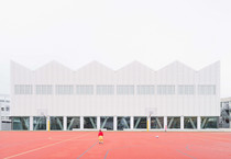
In addition to the aesthetic and functional, structure-forming factors, we consider the constructive formation of a building in conjunction with the materials used to be fundamental for the architectural statement. The interplay of form, space and construction that is crucial to the essence of architecture should not, in our opinion, be knocked out of balance by a one-sided overvaluation of, for instance, the formal (which inevitably always comes back into fashion). When architects and engineers work together in the spirit of partnership, this has an invigorating effect on the development of the project. We understand the technical contributions not as a trigger that sets into motion the consequent optimization of a form, but as an impulse-giver and catalyst for the architectural concept. For the design of the Stuttgart Trade Fair (2000–2007), for example, the Rhodarium in Bremen (1998) or the Municipal Music School in Hamm (2009–2012), the highly expressive load-carrying structures do indeed play significant roles, yet they were only chosen because they reinforced the sought-after allure of the buildings and the atmospheric effect of the spaces. In this respect, we certainly see ourselves in the tradition of the so-called Stuttgart School – as the representatives of a new generation that has left behind the discourse on historicism and modernism. This gives us the basis to act freely and puts us in a position where we are able to take on the responsibility for the desired balance all the more comprehensively.
In our experience, the fact that general planning services are provided with increasing frequency, also by our firm, can be of great help. When the governing parameters set out by the client are right, such services are a step in the right direction toward managing demanding construction tasks. This is the case when not the liability issue, but the responsibility for the work is of primary concern.
We often deal with auditoriums and large halls, where the large span widths alone mean that the load-bearing structure plays an important role in defining the spatial structure. The technical distribution systems can also take on such a function – as with laboratory buildings, for example, which is an area where we are becoming increasingly involved ever since a noticeable departure from purely functional buildings and the so-called technical “machine” has been underway. Of increasing importance now are buildings that meet the high scientific standards for the research conducted there – and do so also through their architecture. This kind of synergy had been disregarded for decades, which has led to an incomprehensibly blatant discrepancy between the substantive and architectural aspirations.
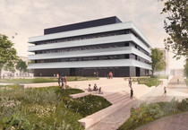
We see the German Center for Neurodegenerative Diseases (2011–2017) at the University Hospital in Bonn as one example of the new developments taking place in demanding research facilities that have already been described. A similar design attitude is exemplified in the Bavarian State Office for Health and Food Safety in Erlangen (1997–2003), a large research facility that we built more than ten years ago. Here, too, it is an adjacent woodland that characterizes the place and acts as an important point of reference for our design. By dividing up the building volume and retaining the characteristic groups of trees, it was possible to preserve the essence of the site.
Such building projects, where the building technology constitutes more than half the work, require that the architect understands the technical systems and does not see them as a necessary evil to be concealed, more or less out of discontent. Part of our task is also to scrutinize the sustainability of these systems. Even when they incorporate lots of technology, our buildings should never seem to be primarily technical in nature. We do not want to succumb to ostensibly innovative fascination with high-tech architecture. Taking inspiration from Louis Kahn – and against the background of a humanistic image of humanity – we prefer to ask what a building wants to be.

![[Translate to en:] wulf architekten](/fileadmin/_processed_/c/b/csm_230719_UnIT_Detail_Copyright_web_bfa906bf5c.jpg)
